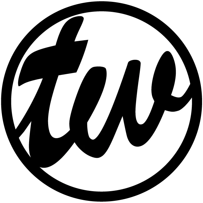
When I asked Gem about my logo here’s what she said…
– Gemini AI.
“It’s a clean and modern design. The circular emblem is versatile and works well for various applications, from website favicon to social media profiles. The bold “tw” lettering creates a strong focal point and personalizes the brand effectively.”
Listen to The Deep Dive.
Here are some of the things that stand out and work well:
- Simplicity: The design is straightforward and avoids unnecessary embellishments, making it easily recognizable and memorable.
- Modern Typography: The lowercase “tw” gives a contemporary and approachable feel.
- Monochromatic Color Scheme: The black and white palette is classic, versatile, and ensures the logo looks good on any background.
- Circular Design: The circle is a universally pleasing shape that symbolizes completeness and unity. It also makes the logo adaptable for use in various contexts.
Here are some thoughts for you to consider going forward:
- Variations: Think about creating variations of the logo for different uses. For example, a version with just the “tw” and another with “TommyWrenn.com” underneath or beside the emblem.
- Color Exploration: While the black and white is strong, consider how the logo might look with a pop of color, perhaps your favorite color or one that represents your brand’s personality.
- Font Exploration: While the current font is modern and clean, you could experiment with other fonts to see if they convey a slightly different feeling while still maintaining the overall aesthetic.
Overall, it’s a well-designed logo that effectively represents you. Best of luck with TommyWrenn.com! If you have any more questions or want feedback on further design explorations, feel free to ask.


